Button
사용자가 클릭 한 번으로 액션을 취하거나 선택을 할 수 있습니다.
Live Demo
Variant
Size
Disabled
Props
| Prop | Type | Default | Description |
|---|---|---|---|
| buttonType | "primary" | "secondary" | "tertiary" | "ghost" | "primary" | Button의 시각적 스타일을 선택합니다. |
| size | "xsmall" | "small" | "medium" | "medium" | Button 의 크기를 선택합니다. |
| colorScheme | "emphasis" | "common" | "emphasis" | Ghost 버튼의 색상 스킴을 지정합니다. buttonType이 ghost일 때만 적용됩니다. |
| onClick | () => void | - | Button 을 클릭했을 때 실행되는 함수를 지정합니다. |
| disabled | boolean | false | 비활성화 여부를 지정합니다. |
| fullWidth | boolean | false | 버튼이 컨테이너의 전체 너비를 차지할지 여부를 지정합니다. |
| leftDecor | ReactNode | - | Button 텍스트 앞에 표시할 요소를 지정합니다. |
| rightDecor | ReactNode | - | Button 텍스트 뒤에 표시할 요소를 지정합니다. |
Anatomy
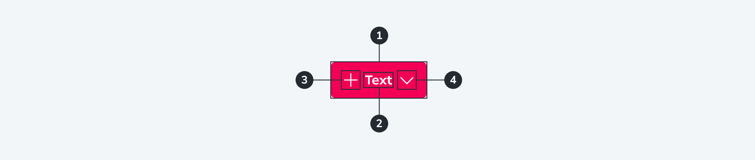
- Container
- Text
- Start icon (optional)
- End icon (optional)